The Art of Data Visualization: Transforming Numbers into Stunning Visuals
The art of data visualization is an essential skill in today's data-driven world. It involves transforming raw numbers into visually appealing graphics that tell a story. Effective data visualization not only enhances understanding but also engages the audience, making complex information digestible at a glance. By utilizing various visual elements such as charts, graphs, and infographics, creators can present their data in a way that highlights significant trends and insights, allowing viewers to grasp critical points swiftly.
To master the art of data visualization, one must consider key principles such as simplicity, clarity, and accuracy. A well-designed visualization should prioritize essential information while maintaining an aesthetically pleasing layout. Employing contrasting colors, clear labeling, and intuitive design can further enhance the effectiveness of the visuals. Moreover, understanding the audience is crucial; tailoring visuals to their preferences ensures that the message resonates and has a lasting impact. By following these guidelines, individuals can unlock the true potential of their data, turning numbers into captivating narratives that inspire action.
Top Tools for Creating Beautiful Data Visualizations
Creating stunning data visualizations is crucial for effectively communicating information. Whether you are an analyst, marketer, or educator, having the right tools at your disposal can make a significant impact on your presentations. Some of the **top tools** in the market include:
- Tableau – A powerful tool that allows users to create interactive and shareable dashboards.
- Power BI – Ideal for business intelligence, facilitating data analysis and visualization effortlessly.
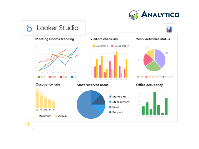
- Google Data Studio – A free tool that integrates well with other Google services, offering seamless data visualization capabilities.
In addition to these popular options, tools like Adobe Illustrator and Infogram are exceptional for those looking to customize their visuals extensively and create compelling infographics. Each tool has unique features and advantages, making it essential to consider the specific requirements of your project when choosing the right one. Remember, the end goal is to transform your data into visuals that are not only beautiful but also easy to understand and actionable.
Why Data Visualization Matters: Making Sense of Numbers in a Visual World
Data visualization plays a crucial role in our increasingly complex world, where information overload can overwhelm even the most analytical minds. By transforming numerical data into visual formats—such as charts, graphs, and infographics—we enable ourselves to grasp significant patterns and trends that might otherwise go unnoticed. For instance, a simple bar graph can illuminate differences in sales data across various regions, offering stakeholders immediate insights that facilitate informed decision-making. In an era where decisions increasingly rely on data, the ability to communicate findings visually is indispensable.
Moreover, data visualization fosters better storytelling with numbers, making insights accessible to diverse audiences. Visuals not only capture attention but also enhance comprehension, allowing even non-experts to engage with data meaningfully. As businesses, researchers, and educators strive to convey complex information clearly, effectively utilizing visual tools becomes essential. Indeed, conveying data visually can reduce the cognitive load on viewers, encouraging engagement and retention of information, ultimately leading to a more informed society.